Considerations on the importance of data and science in data science
Learning data science with COVID-19
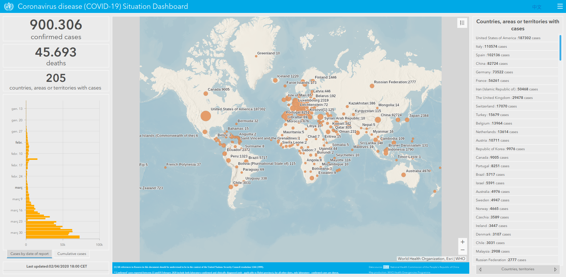
 Yet another COVID-19 dashboard. It may not be very insightful, but I love it because it’s mine
I must confess: during these days of lockdown, I have been toying with dashboards and infographics about COVID-19 outbreak, just like everyone else. I have made an interactive dashboard with nice plots, some formatted tables and even some (basic) maps. It’s shiny and nice, you can spend some time playing with it turning layers on and off, hovering, zooming… And, honestly, I have to admit that I am proud of some of the results I have achieved. And yet, it is flawed. Just like everyone else’s (or almost). And yet, I will keep improving it, even though I’m afraid it will always be flawed and even though I acknowledge that it will never be a contribution to improve knowledge on the topic.
Why, then, am I persisting on keeping working on it if I know I cannot change its fate? Admittedly, at some point, I asked myself that very question and I even considered quitting. Not only I didn’t want to lose my time (even in these days when we are locked down at home there are plenty of things we can do), but I didn’t want to contribute to generating noise, misinformation and even more dramatism about an already important drama. Because that’s what flawed graphics do. But in the end, I realised that working on a dashboard like that could be a great opportunity for learning by doing.
Many types of lessons can be learnt from it, like those related to technical skills, or those related to how data is gathered, visualized and analyzed. Today, when data and figures on COVID-19 are everywhere, I want to share some reflections on the science (or lack of it) in data science.
1. Get the (right) data.
As obvious as it sounds, there is no data visualization nor data science without data to visualize or analyze. Therefore, the first thing that anyone who wants to make any type of data visualization or data analysis is to get the data. Second: we cannot use any type of data. We need to use good data, and by good I mean reliable, usable (in terms of licences, formats and structure), up-to-date and frequently updated, and, hopefully, official data that is representative enough to explain the phenomenon we are studying. While this is usually non-trivial, it is even more crucial if we are to explain a completely new phenomenon that it is happening as we speak and it does at a global scale like COVID-19.
Usually, there are only two possible options1: either gather data by ourselves or rely on others' data. Whereas gathering our own data might be the best choice for some scenarios, in the case of COVID-19, it is unlikely that we are in a position to gather the kind of data that might be useful for us (in fact, even governments are struggling to do so, as we will see). Therefore, we are left to just one option. Of course, we cannot rely on some random person or institution, we need to rely on someone we can trust, like universities (because they tend to provide rigorous data), governments (because they provide official data) or organizations (like the World Health Organization). But where do we get the data from?
While most governments provide data in open licences that allow its use and reuse for any purpose, they usually fail to address another important issue: the file format and data structure. As a result, in countries like the UK or Spain, data is not ready to consume as it is, without manual work2. Others, such as WHO, provide nice dashboards with data, but they do not provide the raw data to be consumed by 3rd parties. The good news is that there are people and institutions who are working in releasing clean data with open licences, such as Datadista for data in Spain, University John Hopkins that gathers data from different governments and WHO, and even packages like this one for R that fetches data from UJH and provides a nice data frame for developers and data scientists to use in their projects.
As a result, it is no wonder that most infographics and dashboards worldwide rely on the same data sources. It seems a sensible decision: not only we get data which is ready to use, but we do it from trustful sources. And yet, as I will argue, it is because of that reason that most of them are wrong. But what could possibly go wrong?
2. Don’t take data too seriously
Now that we know where to get the data from, there is something we have to be aware of: by relying on data generated by others we have not solved the (main) problem of data gathering, we have simply transferred the responsibility to somebody else, but someone still has to deal with what we have been trying to avoid. And, surprise, not every country gathers the data in the same way.
Take the case of the most basic and crucial question: how are the number of confirmed cases defined. Since COVID-19’s symptoms are very similar to those of influenza and the only way to know if someone is infected by it is by testing positive in the tests3. This seems a great definition: we have an objective test which is same the for everyone and all countries seem to use the same criteria. Unfortunately, those tests require equipment which is scarce (compared to the current worldwide demand), can only be made in hospitals, and require up to two days to get the results. Therefore, there are many other scenarios that are not considered within this test, such as those shown in figure 2a. So yes, every government provides that figure, yet all of them are much lower than the real figure. How much lower? There is no way to know.

Let’s focus on another example: the number of deaths by COVID 19. Apparently, this should be easier. Every country keeps a record on the number of deaths per day and its cause of death, so it should be easy to filter those who died from COVID-19 amongst all the possible causes. Well, no. As we have seen, if we can’t define with precision the number of people who are infected by COVID-19, we will not be able to know the number of people who have died as a result of it.
But it can be even trickier if we consider that every country has different criteria on how they count the number of deaths of people who were tested positive4. Take the case of UK’s definition:
The figures on deaths relate in almost all cases to patients who have died in hospital and who have tested positive for COVID-19.[…] These figures do not include deaths outside hospital, such as those in care homes, except as indicated above.5
So, again: real figures are much higher than those reported, no matter which country made the measurements. All of them are wrong. Some people argue that governments do not want to provide real figures not to create even more social alarm, lose popularity with their voters or even to look better than other countries. However, often the simpler answer is the most probable one6: it is not that governments want to hide information from us, it is just that no country has the means to face this outbreak, nor to mention to take accurate metrics. And here lies another drama of COVID-19 that goes beyond the personal tragedy: no country in the world is prepared for the stress test that COVID-19 represents.

But let’s go back to our path: that of data and figures. At this point, we have to acknowledge that all the data is flawed and we cannot get a perfect picture of the real situation out of them. If we wanted to do so, we would need to use other data sources, like comparing the record of total daily deaths7 with the same period last year(s). Of course, this will need more time, and, in turn, this also has other implications and problems (for example, it will not give an accurate number of deaths by COVID-19, as there is no way to know their cause of death, but the significant difference between periods could be a good proxy).
So we have two options now, either losing faith completely in all COVID-19 infographics and metrics or to acknowledge their limitations and assume that they are just a rough approximation to reality.

3. Choose the right figures and visuals
Great! If you are reading this it means that you are ok assuming that reality is (as always) far more complex than what nice dashboards can ever show, no matter how fancy they are. And speaking of that: beware of fancy visuals!
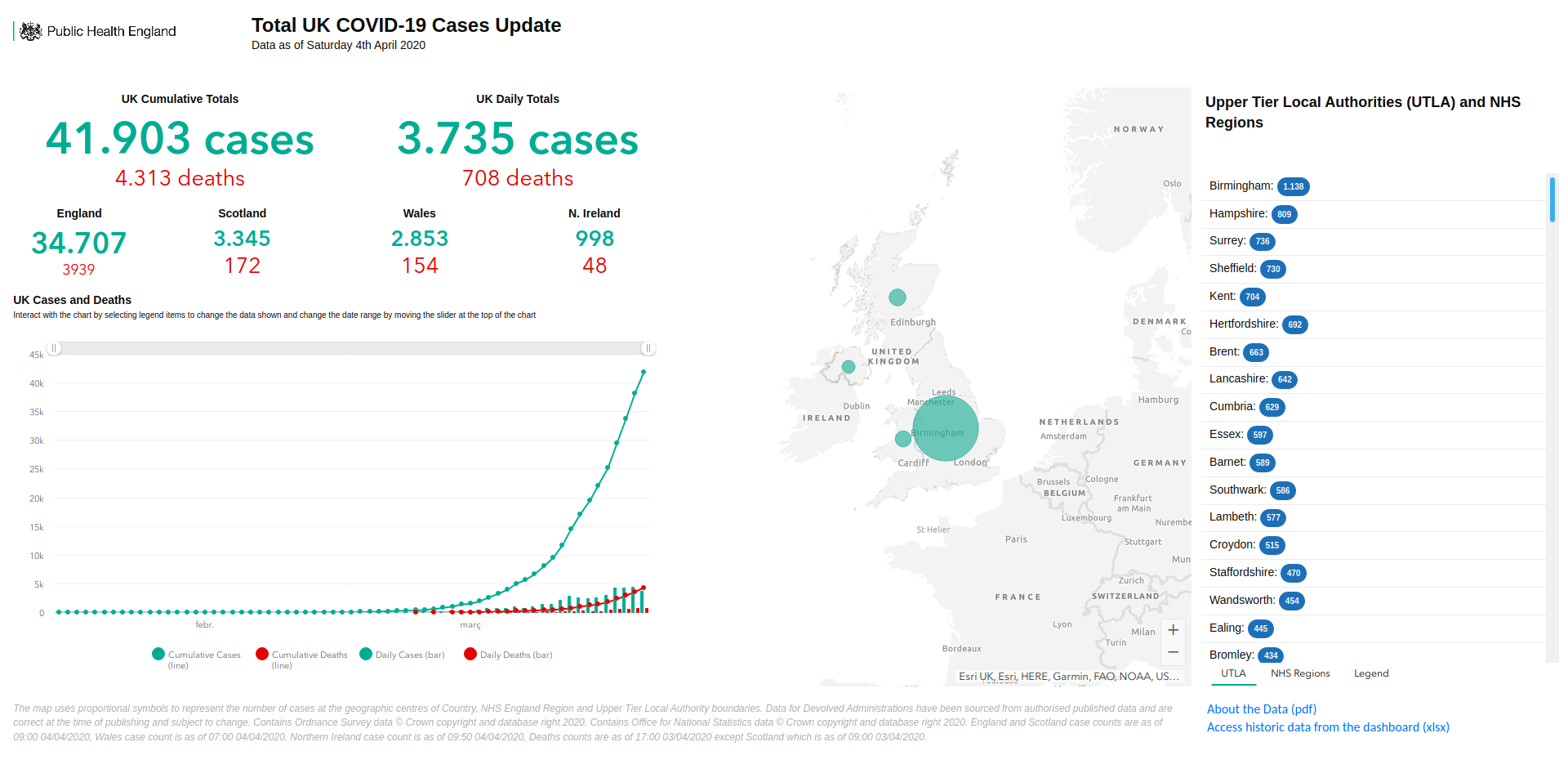
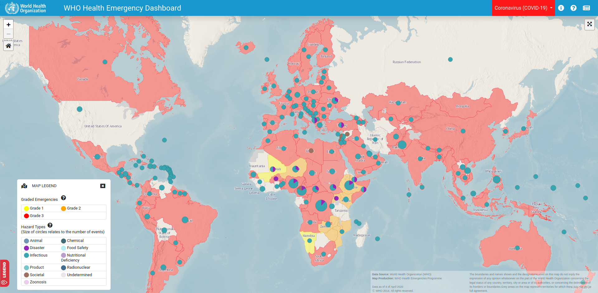
I’m sure that at this point you may have seen plenty of neat infographics of any type, like the ones above: some of them use boxplots, other lines, other scatterplots… some of them have smooth edges, others have axis with logarithmic scales. Even there are some that want to introduce geospatial analysis and present maps of different kinds (choropleths, bubbles, sizes)… and if you are like me, you can enjoy watching them and interacting with them during hours. But are they really effective to display useful data? Unfortunately, most of them are not (even some of my own).
One of the most basic yet frequent is to display a big figure of the total cases within a country. Big figures are really catchy and easy to understand, but they usually lack some context to make them really meaningful. Of course, anyone can understand that a 7-figure number is a big one, but it is really difficult to know how big it is. We need to compare it to something else to wholly grasp its real magnitude. Also, since we are dealing with a cumulative figure, knowing the analysed time span is a must, as it is not the same to reach a certain figure in one day, one week, one month or one year.
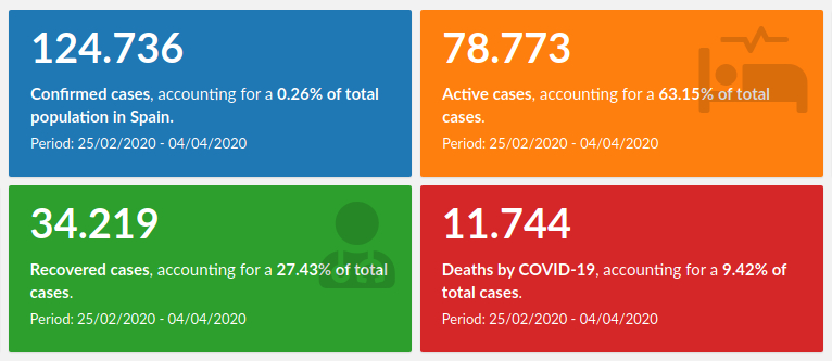
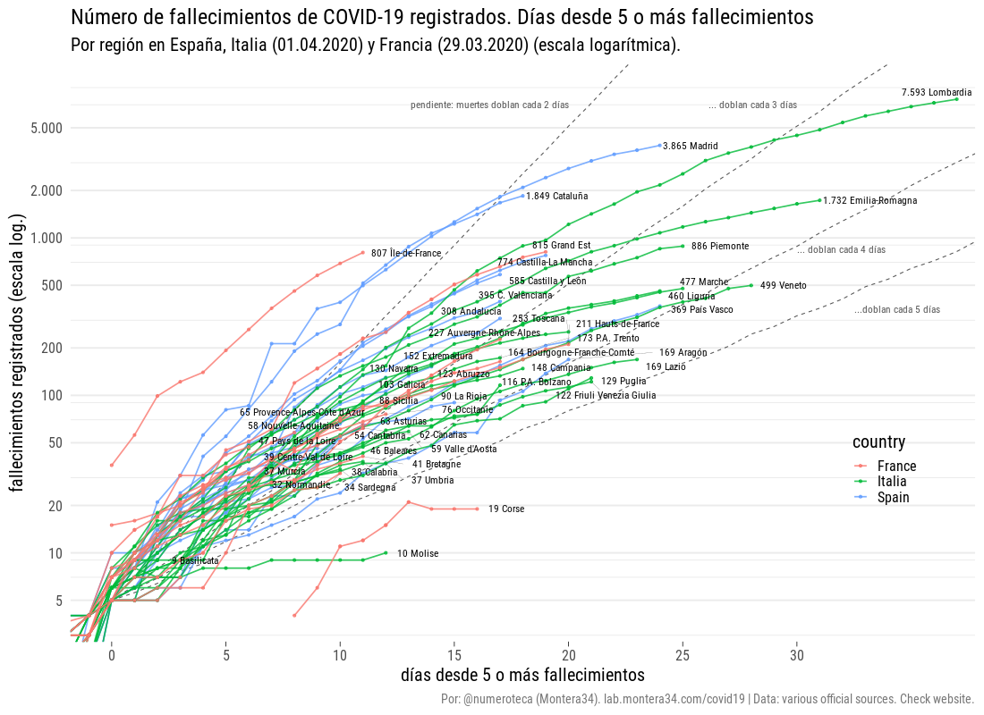
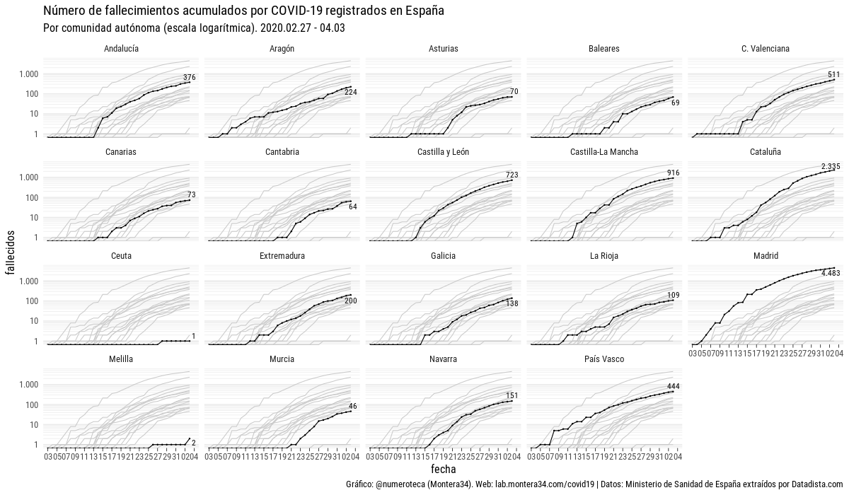
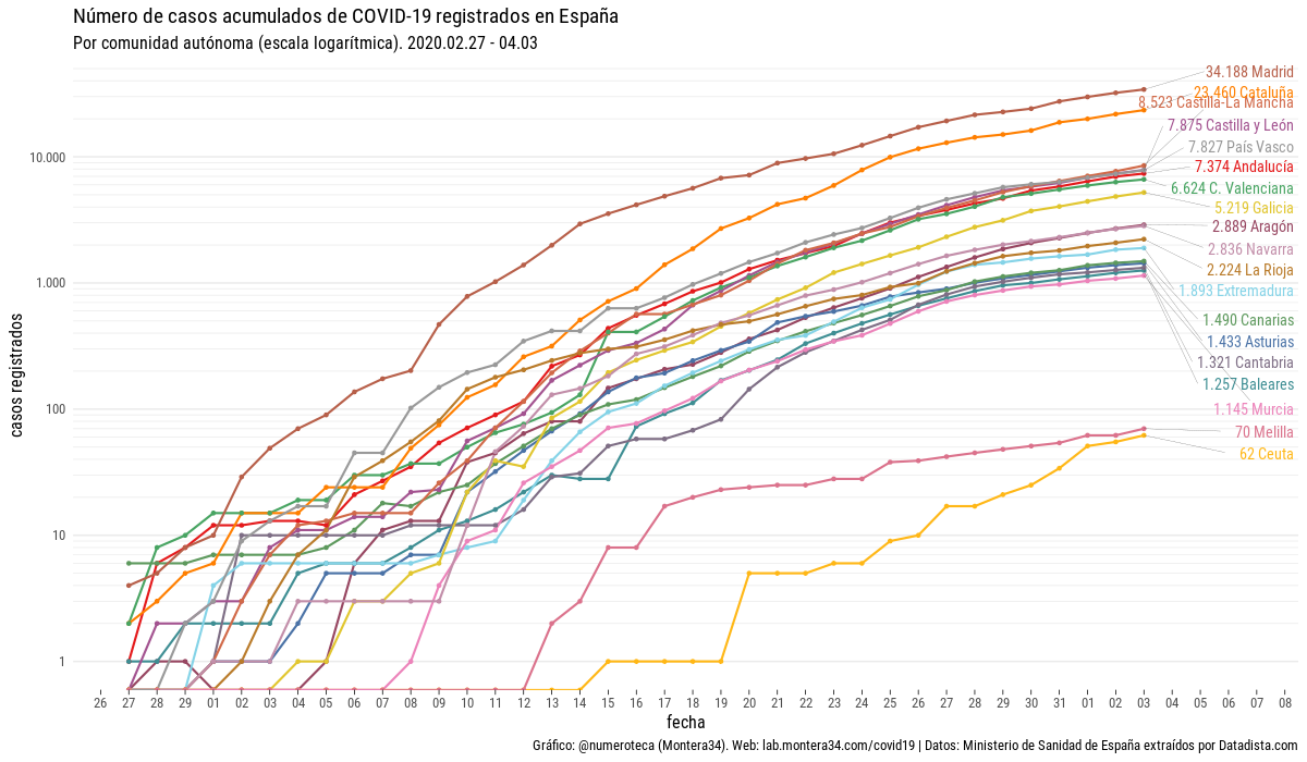
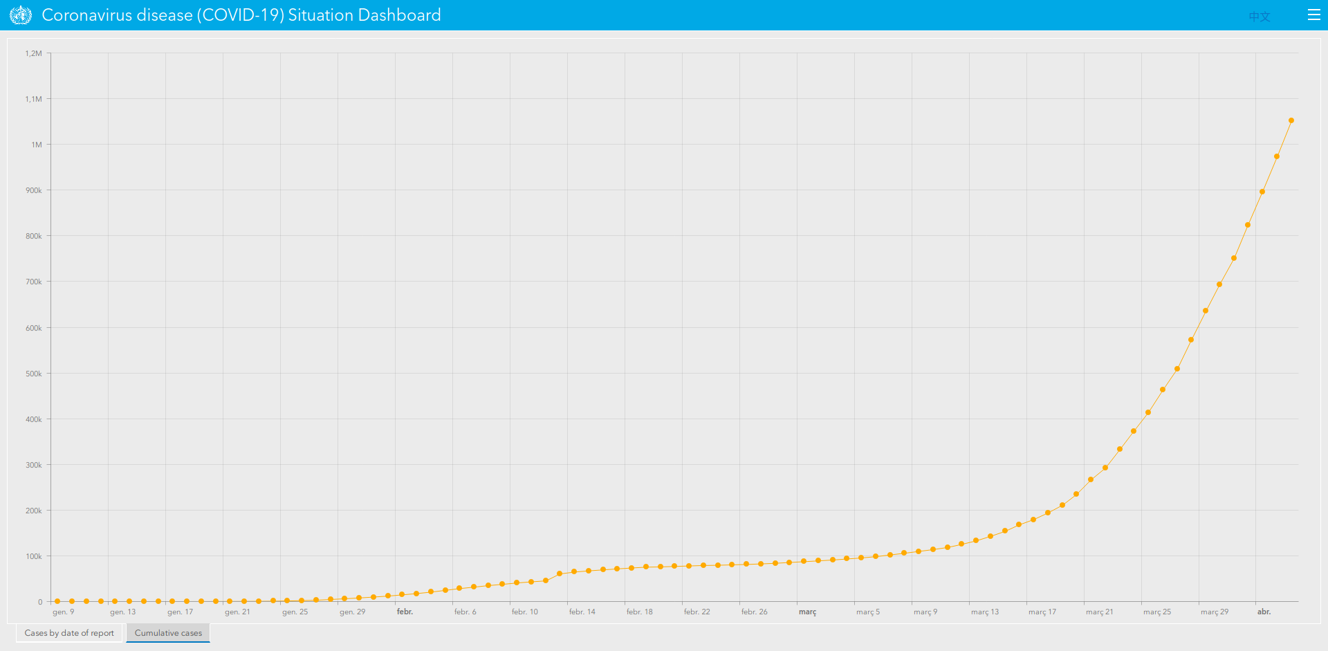
A common variation of that is to provide a line plot of cumulative cases, with the dates on the X-axis and total cases in Y-Axis. There are several variations of that: displaying relative data (eg: number of cases/population), with logarithmic scale (in order to make it easier to see the variations of the first days when compared to most recent ones), displaying several categories, either representing different regions or type of cases… Whereas they are really effective and most of them are right from a technical standpoint (especially considering that some of these variations make a great difference), it is the representation of figure itself that may be of little or no use. Is it really representative of something? What kind of questions can we answer by providing a number that, by definition, will always grow?
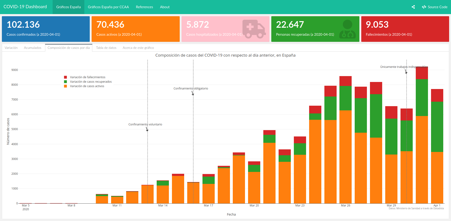
It is for that reason that some have decided to use other indicators in order to assess the evolution of the pandemic, such as the number of new cases per day, as they allow us to easily identify if figures are better or worse than the previous day. Again, the same variations of the previous plots can be made in order to make this even more insightful, such as the following barplot, which displays the daily variation of cases, grouped by types. Not only we can see that they are starting to lower, but also, that the number of recovered cases is increasing over the deaths or active cases.
This is indeed more useful than cumulative cases, although it is somewhat volatile and can lead to confusion. Take the image below, as an example:
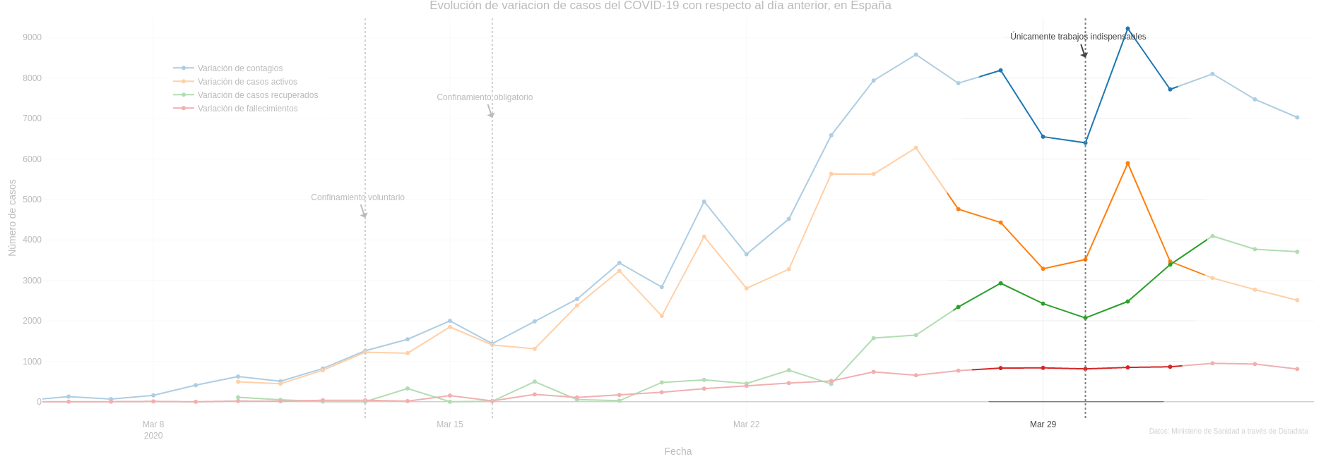
Can you see how all figures suffer from a dramatic fall on 29th and 30th March just before peaking again the day after? This is indeed an unexpected behaviour and really difficult to explain. Unless we realise that those days were Saturday and Sunday, and due to the fact that there are fewer people working at hospitals, data is not taken as fast as usual and therefore, accumulates on Monday. This phenomenon has been called “the weekend effect” (Did I mention that you should not take data too seriously? 😉)
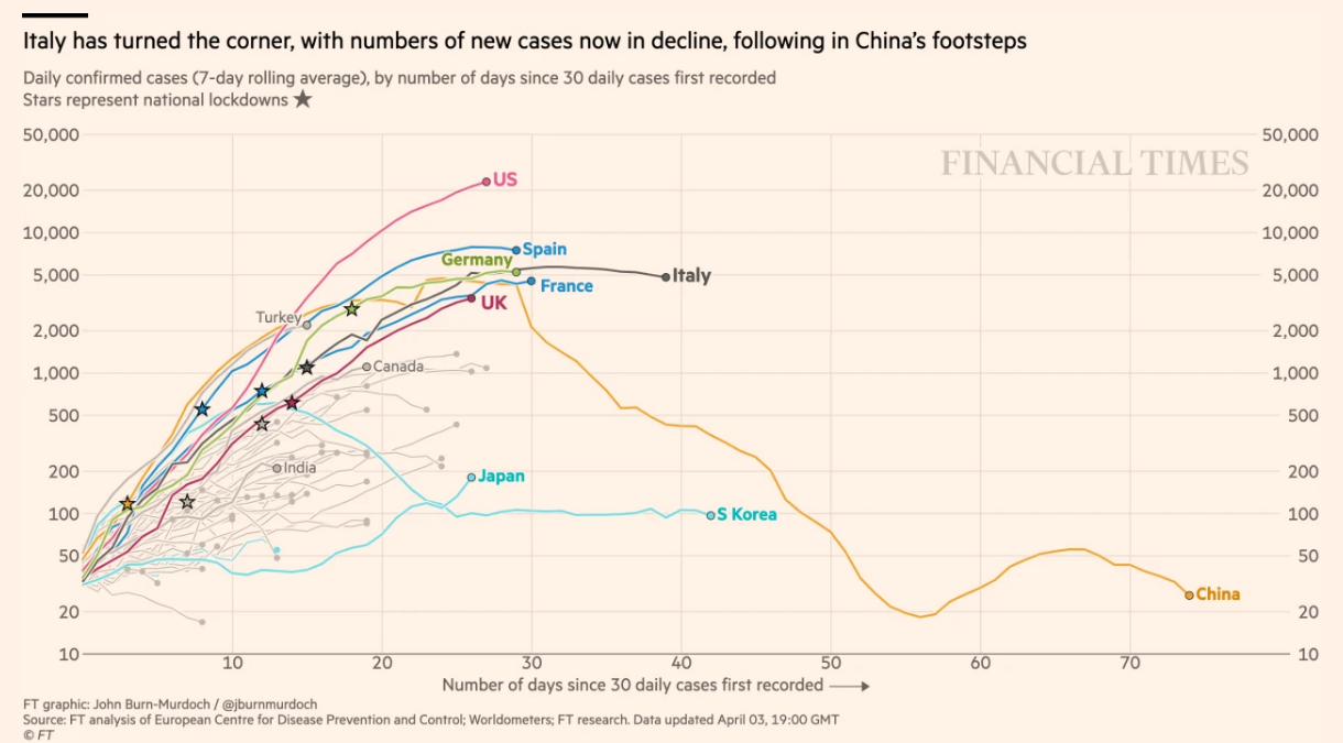
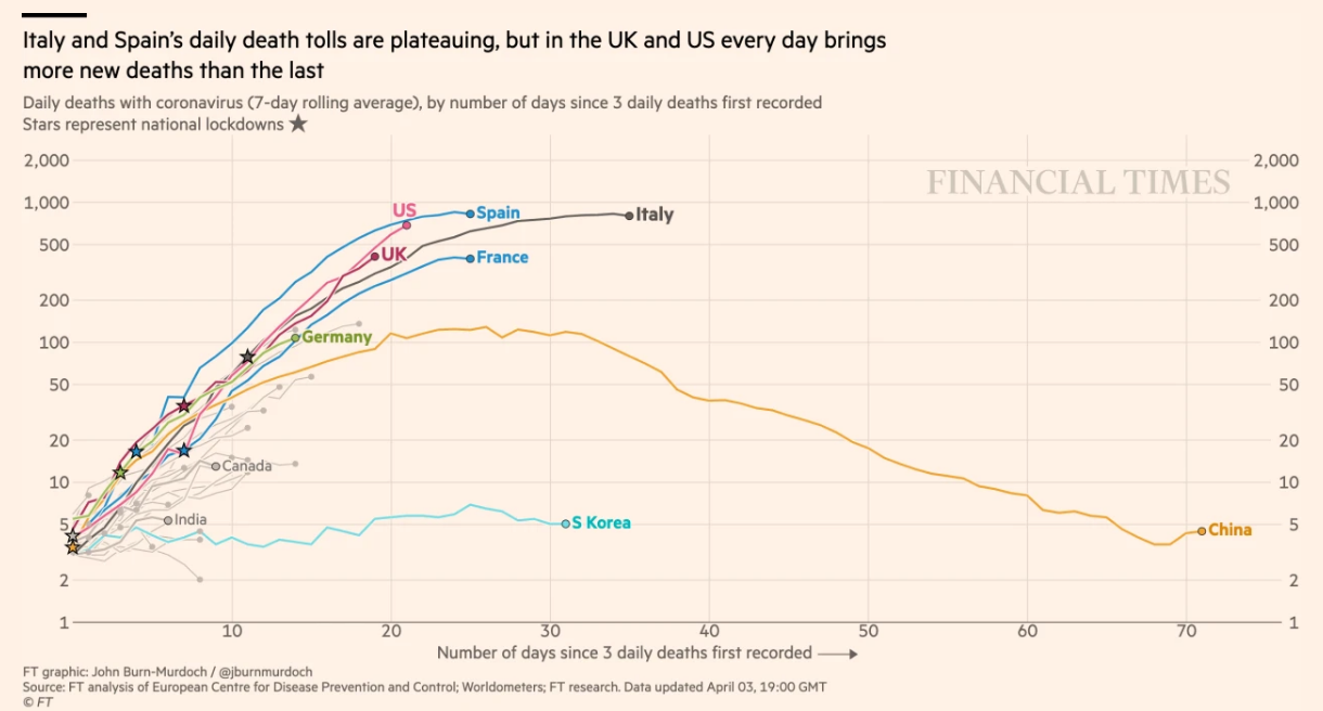
It is because of that that some others, such as John Burn-Murdoch from Financial Times, prefer to use a rolling average of a fixed period (such as 3 or 5 days), which is a more stable figure, such as that shown in the figure below.
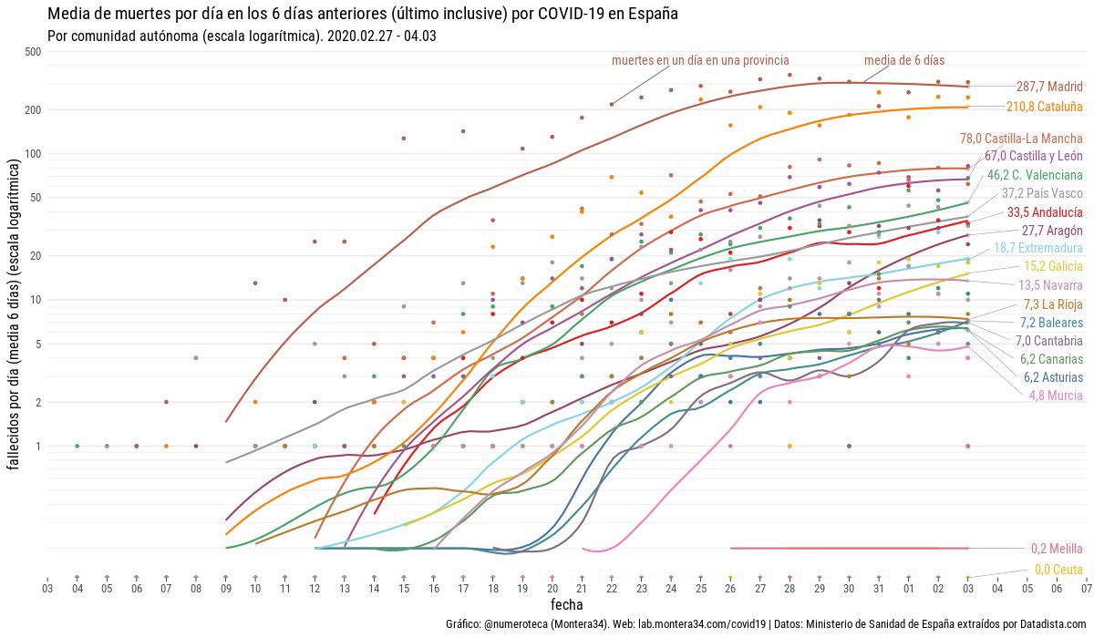
Other techniques used to fix those outliers and display tendencies are to use smooth line plots based on the actual data, like the following plot made by Pablo Rey.
4. Do not make hasty comparisons
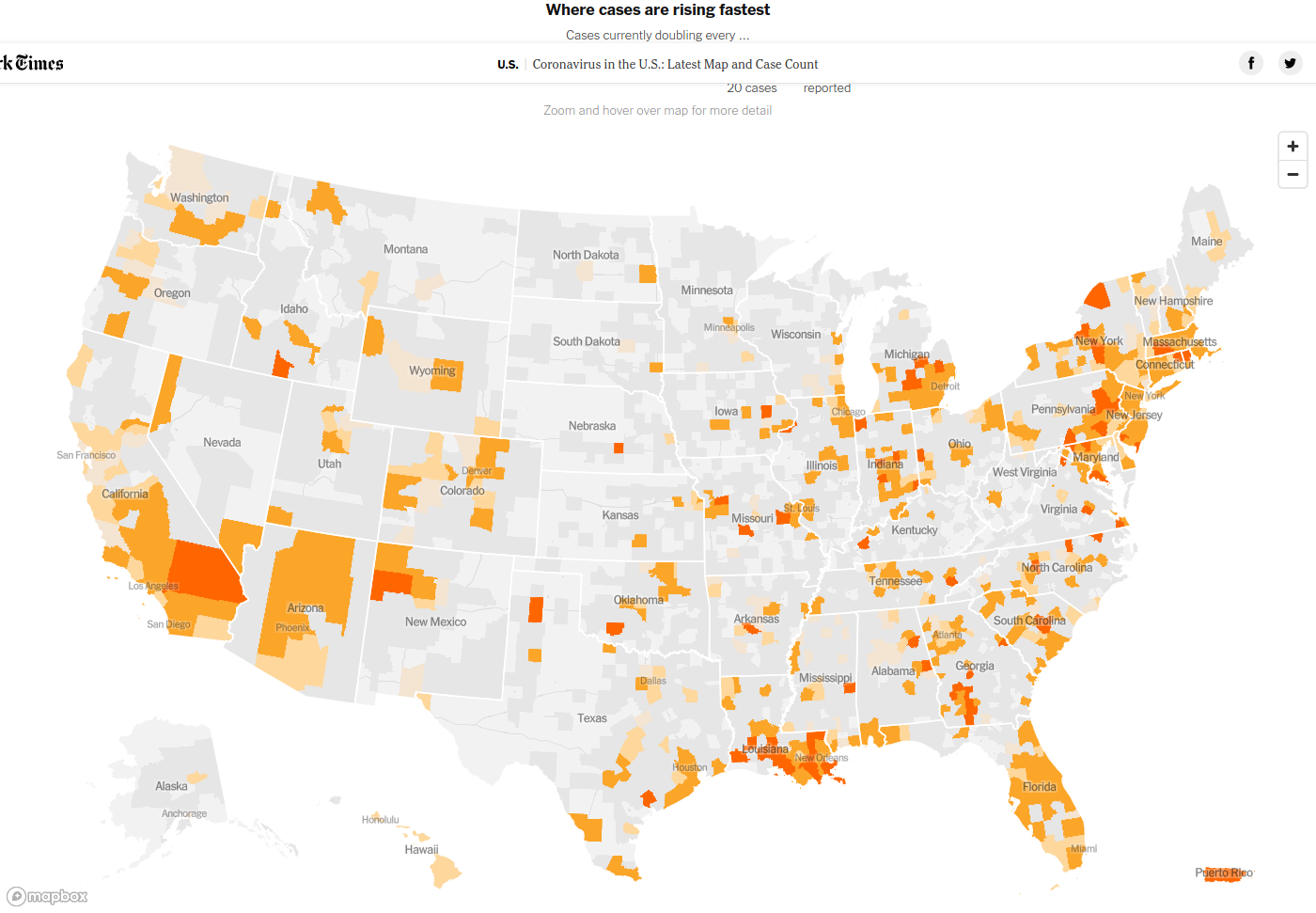
Surely, the most frequent type of visual is that comparing how COVID-19 is affecting different regions, either within a country or comparing different countries (usually using China or Wuchan as a reference -after all, it is where it all started). While this kind of plots could provide answers to questions such as how a specific region is doing regarding another one (and therefore, replicating or avoiding their measures against COVID-19, for example), those comparisons are really problematic. For starters, the fact that population or size is largely different invalidates any comparison in absolute terms.
But even when using relative values (eg: number of cases per inhabitant), there are other key factors that have a direct impact on the evolution of the disease and its effects are assumed to be the same, while in reality can differ in several orders of magnitude, such as demography8, geography, urban settlements or health systems (in terms of human and financial resources), just to name a few.
Amongst all those differences, though, the most relevant well may be the number of tests done to detect COVID-19, a figure that is not just different but also usually unknown. This is by no means trivial, as we have seen that the number of cases is defined using this parameter. Therefore, if a country performed a really low number of tests, it will also have an extremely low number of cases. Out of sight, out of mind.
So, the biggest problem here is that without taking into consideration those factors, comparisons may render plenty of biased conclusions that have nothing to do with reality, such as come countries may be dodging COVID-19 or are kind of immune, or that COVID-19 only affects countries with a bad health system, unorganized governments, or undeveloped countries. As a result, there is a risk of developing a narrative of moral superiority9 based on totally wrong foundations like what some politicians have started to do in their own self-interest10.

5. Take predictions even less seriously
The last group of plots, and the most complex ones, are those that make predictions. While they are really appealing and, apparently, provide answers to one of our main concerns (“When is this going to end?” / Will this last any longer?) in a very understandable way, they are really tricky. There are several ways to make predictions, such as using linear regression or models. While a model can be as easy11 or as complex as we want it to be (and as a result, their accuracy will differ dramatically), they mostly rely on having a good set of historic data or knowing the logics of the phenomenon they want to describe. Unfortunately, since COVID-19 is a new phenomenon, we are lacking of both, and therefore, predictions at this stage are prone to errors. Some predictions are based on what has happened in other places where the outbreak started before, but we have seen how problematic this can be.

Last, but not least, we should not forget that they require a large amount of knowledge of a particular field something like most of the people who are doing those nice visualizations (including myself) lack of. Therefore, since I have openly admitted that this is something beyond my knowledge, at this point I can only but recommend to be sceptical about any prediction that is not made by an authority on the field. And even in that case (provided I could understand it), I would recommend caution. Or even better: just rely on predictions if they were made by epidemiologists and you are one of them.
Wrapping up
As argued, if data visualization is never easy, it is even less so in the case of a novel phenomenon such as COVID-19. Therefore, when facing any type of visuals, we should proceed with caution. If you are doing (or planning to do) any type of visualization, ask yourself what question do you want to answer and which is the best way to do it, take into account the aforementioned considerations and make them evident to your readers12. Also, make your analysis reproducible, so anyone could tell you if you did something wrong or even fix it by themselves. If you are simply watching them, look for all those explanations, and if you can’t find them, ask for them, help the author or simply ignore it and look for an alternative. But in any case, you should always remember not to take data too seriously or too blindly. Data by itself is not what really matters, is what we do with it and how we do it in order to achieve knowledge what really matters. And here’s when science plays its role.
There is a third scenario: to infer or calculate the data from other datasets. ↩︎
For example, UK releases its data stored in a single XLS file, without a clean structure. Not only they use a proprietary format, but they mix data with metadata on the same file, even in the same sheet, instead of using a wide format where every column is a field and every row is an observation or a long format where keys and values are stored as in a dictionary. On the other hand, Spain decided to release the data in PDF. PDFs are great for visualization because they are an ISO format and can be opened with plenty of different softwares. Unfortunately, it is not great for consuming data, as it is not structured in any way. ↩︎
At the time of writing this post, and according to wikipedia’s page, the WHO has published several testing protocols for the disease. The standard method of testing is real-time reverse transcription polymerase chain reaction (rRT-PCR), typically done on respiratory samples obtained by a nasopharyngeal swab and results are generally available within a few hours to two days. ↩︎
This article from El Pais (in Spanish) https://elpais.com/sociedad/2020-03-29/cada-pais-cuenta-los-muertos-a-su-manera-y-ninguno-lo-hace-bien.html ↩︎
https://www.gov.uk/guidance/coronavirus-covid-19-information-for-the-public ↩︎
This is the commonly phrased version of Occam’s razor principle. ↩︎
In Spain https://www.isciii.es/QueHacemos/Servicios/VigilanciaSaludPublicaRENAVE/EnfermedadesTransmisibles/MoMo/Paginas/Informes-MoMo-2020.aspx ↩︎
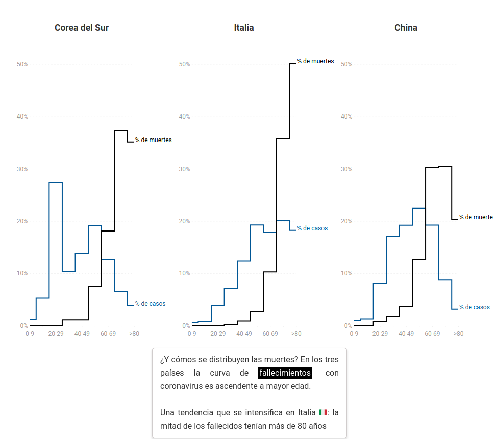
Refer to this (excellent article in El Diario comparing Italy and China -in Spanish) which focuses on the fact that coronavirus mortality rate differs enormously according to the age. ↩︎
Refer to The spread of the coronavirus across Europe against the right-wing Central European narrative (Publico, in Spanish) ↩︎
Take as an example the unfortunate words by Dutch finance minister Wopke Hoekstra, who suggested the EU “should investigate countries like Spain that say they have no budgetary margin to deal with the effects of the crisis provoked by the new coronavirus in spite of the fact that the eurozone has grown for seven consecutive years”, a statement that was later qualified as “repugnant” by Portugal’s Primer Minister, António Costa. (Source: Politico) ↩︎
Just to give you an example of how easy can be to implement a prediction in R, refer to this article: http://www.sthda.com/english/articles/40-regression-analysis/166-predict-in-r-model-predictions-and-confidence-intervals/ ↩︎
Also, reading this post may be useful: Ten Considerations Before You Create Another Chart About COVID-1 ↩︎
Carlos Cámara-Menoyo
Architect. PhD. Lecturer. Life-long Learner. Transdisciplinary.
I love learning, teaching and researching, as well as sharing and visualizing data, specially with maps. I have a technical and social background and my multiple research interests are centered around the commodifications between cities, technology and society within informationalism and free culture paradigm. So far, I have applied that approach on the topic of social and spatial inequities.